Originally posted by The Business Marketing Institute, by Eric Gagnon
We’re hearing all kinds of news about companies pulling out of their print advertising schedules, with no end in sight. At the same time, there’s a lot of happy talk out there from people in and around the construction marketing field telling you that cutting back on print advertising is a bad idea.
Yes, cutting back on advertising that generates measurable sales response (that’s sales leads), and that pays for itself over your sales cycle is a bad idea. However, most advertising doesn’t do this: Most advertising is a foolish, very expensive exercise in buying fairy dust called “branding,” which can’t be measured, and which usually has no impact on product sales.
In good times, a company will go along with the notion that running expensive full-page ads that do little more than make an appearance in a publication to create a weak memory in the mind of the prospect about your product (this is called “brand awareness”), and that this will work its mojo on those mystical forces that cause people to buy from your company instead of someone else.
But when the music stops, as it has now, companies wise up to the fact that significant parts of their marketing budgets don’t produce anything that can be linked to revenue, and can’t be measured by any rational means even if it did. The smart guys who got you into these advertising programs when times were good don’t have a lot of answers these days, except telling you to keep on doing it, because when others stop doing it you’ll be the only one doing it, so, somehow, you will win.
Huh?
May I suggest a different approach?
Stop Running Stupid Big Ads, and Start Running Smaller, Smarter, Response-Generating Ads
You can, and should, run advertising, if you can run the kind of advertising that motivates prospects to contact your company, and if you can track and measure this advertising against sales closed by your sales team to generate a solid return on this expenditure. Doing this keeps your marketing program generating sales leads in a recession, and doing this with smaller, hard-working, response-generating print ad programs costs a lot less money. This also saves you from being forced to make an all-or-nothing decision about print advertising, especially if your company works with distributors and independent sales rep networks who rely on your advertising program for leads, and, in a larger sense, as a sign of your company’s presence in and commitment to their market.
A program of stripped-down fractional-page ads (quarter-page sizes, for example) using clear, effective presentation that grabs trade publication readers, and presents a strong offer that motivates them to contact your company, can often be the crucial move that changes your print advertising from an expensive cost sink into a measurable, response-generating, investment in sales for your company.
Keys to Producing Smart, Fractional Ads that Generate Measurable Sales Response
Even if you’re delegating the task of producing small-format response generating ads to your ad agency or layout designer, it’s very important for you to have solid knowledge of the principles required to produce these kinds of ads, and for you to apply these techniques to your print advertising projects.
Why? First, you’ll get a better final product if you start with a basic, rough sketch that lays down your product’s key sales benefit, and your offer, because these initial copy and layout notes provide a useful starting point for your agency’s designer who is producing your ads (you’re not designing your ad for your agency, you’re just giving them something to work with by getting the benefits and their visual order down on paper).
Second, and most important, the process of writing down and visually organizing your own product’s presentation is your first step toward developing the skill of identifying effective layout and presentation when it’s done by others on your behalf.
This week, let’s produce an fractional response-generating ad for a hypothetical oilfield equipment company. For this example, we are developing an ad for a company that sells a system which uses a network of sliding valve sleeves tied to a single computer control station that allows the operator to more efficiently monitor and control multiple oil reservoirs tapped by a single pipeline.
Here are the major benefits of this product:
- Shorter detection and response times, leading to:
- Increased efficiency and productivity;
- More economical and reliable than competitive systems
The major sales benefits comprise the most important elements of your ad, the headline and subhead. The headline, usually combined with a product shot, is the most prominent part of a fractional ad. The headline/product shot combination is often set at the top of fractional ads, because magazine page-flippers (your potential prospects) tend to look at smaller ads from the top to the bottom, so setting the headline and product shot at the top of your ad improves its immediate readability. This isn’t a hard-and-fast rule, and if you or your designer come up with a better, more eye-catching layout, you can always try it and see how it works for you.
Which Comes First: The Copy, the Layout, or the Headline?
Now it’s time to produce our ad. If you’re one of those purely right-brained creative types, you could begin with a blank layout and start pushing text blocks around and see what happens. That’s fine, and you may come up with a great layout, but I’ve found the most efficient way to produce an effective fractional ad is to get the most important elements—the headline and product shot— down on your ad space first, work these into shape, and then work the other elements in around them.
Start this process by setting your headline, and making it prominent, and then usually the other elements of your layout—copy, promotional offer, logo, etc. fall into place after your headline.
Let’s say we’ve chosen a quarter-page size for our ad, which for most magazine-format publications is 3-1/2” wide X 4-7/8” high.
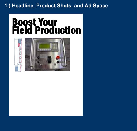
Start by getting your headline and product/application shot down on the page, like so:
We also have a subhead that fills in the rest of this product’s story:
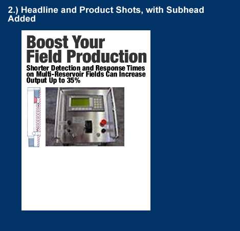
Shorter Detection and Response Times
on Multi-Reservoir Fields Can Increase
Output Up to 35%
Subheads in small ads work best when they’re teamed up with headlines to convey the entire benefit “story,” so let’s move our subhead right up below the headline, like so:
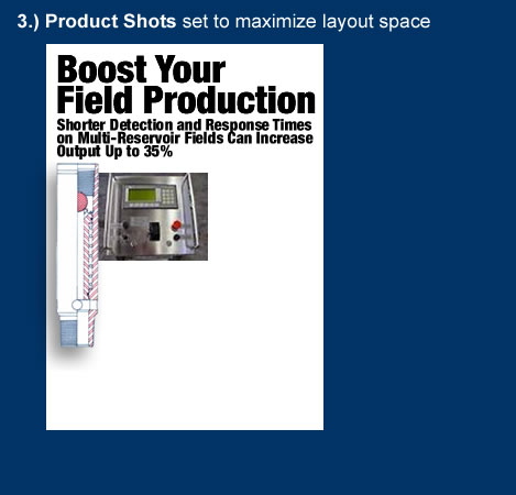
Now, let’s arrange our two product shots (diagram and console photo) so we can work the other ad elements in. This usually involves shifting them to the left or right, and since we have an odd, long graphic, let’s enlarge this for contrast, add a drop shadow, and make it a graphic element of the ad, set over the top of the photo:
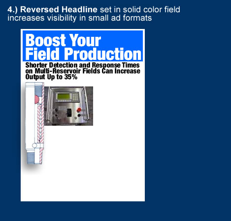
On fractional ads, you can make a bold headline even more noticeable by reversing it and placing it in a solid color field, like so:
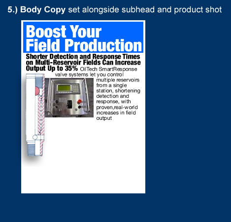
Next, we’ll run our body copy alongside the picture:
The Free Premium Offer
Now we come to our premium offer—this is what goes into our ad to motivate readers to pick up the phone or link to our company’s (or client’s) Web site. It’s the token of value we offer the reader in exchange for asking the reader for their contact information.
Since you don’t have the space available in a full page ad, you need a strong offer to make your fractional ad work, and, next to a free sample or free trial offer (neither or which are practical for many kinds of products), the best offer to make to trade publication readers is an information-based premium that is useful and has value to your intended prospects.
The best free information premiums are the ones that are specialized to meet your prospects’ on-the-job interests, or help them do their jobs in a better, more productive, or more useful way, preferably, while showcasing your company’s product.
Good examples of inexpensive, high-value premiums that present well in fractional ads are:
• DVDs: Specialized how-to- or applications videos involving your product’s field of use;
• Reports: Industry surveys, studies, white papers, or specialized analysis with high perceived value and interest to the prospect;
• Books: Custom-published books on specialized topics directly of interest to your prospects, and involving your product;
• Wall charts or slide guides: Charts or slide-guide calculators, featuring reference tables, calculations, nomenclature or other categorized information in your industry
Pick the right premium for your market and you’ll not only have an item that draws interest and response to your fractional ad, you’ll have an offer that sets your company and your marketing program apart from your competition. You’ll also have a premium offer you can use in your other marketing projects, like mailings, postcard decks, Google AdWords search programs, etc.
Presenting the Premium and the Offer
For our hypothetical example, a slide-guide calculator combining some common and useful oilfield calculations, with some additional calculations showing the projected yield from using our company’s system, would make an excellent free premium offer for our ad.
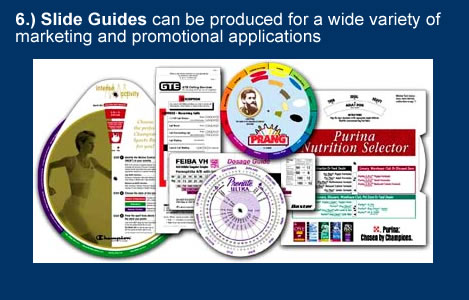
Slide guides, also known as wheel guides, available from companies like Datalizer Slide Charts, Inc. (www.slidecharts.com) can be produced to calculate useful values for an industry-specific application. Best of all, if you’re working with a company or client in a technically-oriented construction field (as most of us are), slide guides can be custom-developed for your particular application.
Slide guides have high perceived value, even in today’s world of ubiquitous handheld electronic gadgets—all you have to do is develop a useful function for one that serves the prospects in your market.
You can produce slide guides for figuring common technical calculations in your industry, or you can produce purely promotional slide guides highlighting features in your product line. You could also create a slide guide that combines objective calculations with products in your line, to match these results to specific product attributes of interest to your prospects.
To finish our ad layout, let’s work in our slide guide art, our copy describing the premium, our grabber headline for our offer, and company logo and contact information:
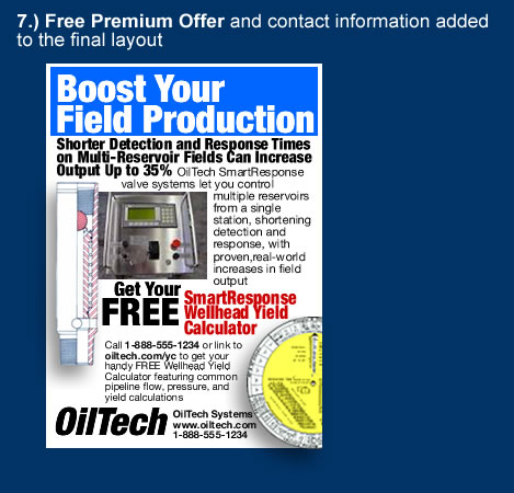
As you can see, we make sure readers see our FREE offer, and we give them the option to both call our company, and link to our Web site, to sign up for the premium. Since they don’t want to bother with calling your company, most readers will link to the Web site.
Which brings up our next point: Make it easy for readers to get your premium, by asking only for the basic information you need to fulfill their request—name, address, e-mail, etc. Most marketers are tempted to make readers jump through hoops by asking too many survey-type questions, or they force readers to speak to a sales rep before the prospect really wants to, since it’s too early in the sales process. Both of these actions drive down response because they turn your prospects off, so don’t do anything to block the open front end of your “sales funnel” too soon.
Testing Different Ad Page Sizes
Once you have a workable fractional ad layout, consider the option of producing another version in an even smaller page size. For example, testing both quarter and eighth-page versions of your ad broadens your marketing options, because it allows you to run your ads more frequently, and in more publications.
How to test: You can test two ad sizes by publication, or alternatively in each issue of the same publication. For example, you can run half-page ads in three issues of one publication and smaller, quarter-pages in three issues of another publication, then switch these ad size placements in these two publications after three months, tracking and measuring your response every month. If your half-page ad is already pulling good response, you may be surprised to find little or no fall-off in response compared to the smaller size. Given the page space cost reduction for these two sizes, this effort could give you a significant increase in your return from the smaller size. You’ll never know if you can get about the same sales response from a smaller ad, unless you try.
Now, Let’s Make It Smaller!
There’s more to making a smaller version of a larger fractional ad than merely producing a scaled down version in the smaller size.
To make a fractional ad even smaller, you must distill the copy and elements down, taking the best elements from the larger size, and you must often discard certain elements (such as product shots) to maintain the boldness and clarity of presentation of the smaller ad.
When you’re working with a very small ad size, sometimes it also makes sense to flip the “story” and “offer” around, by leading with your free promotional offer in the smaller ad size, or presenting it exclusively. This allows you to compensate for the reduced size of your smaller ad by getting that very powerful word, “FREE,” right up on top of your smaller ad.
And since we want to produce a very small eighth-page ad size from a quarter page ad, we’ll try this in our ad, shown here:
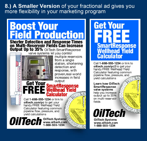
From the standpoint of visual drawing power, both of these ad sizes hold their own against much larger ad page sizes, as you can see below:
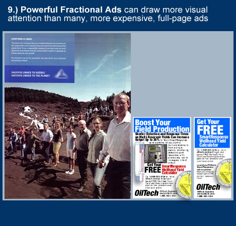
If you are working with a limited marketing budget, having two strong ad sizes like these gives you more flexibility in your ad space buying options. This means you can run in more issues of a publication, and you can expand your print advertising to more publications in your field.
Fractional ads like these, using bold, clear presentation of benefits, and strong premium offers, are the lead generating workhorses of business-to-business marketing programs, generating sales leads month after month, and this is the approach you can take to get the most from your marketing budget in the tough environment ahead.
Originally posted by The Business Marketing Institute, by Eric Gagnon

very good post. It is true construction companies are stuck in a rut with advertising, it is hugely expensive and from my experience can provide very few leads. It’s almost like companies have to seen to be there! A message to customers and competitors alike that we are still here and we have the money to place these ads. Don’t forget about us. The smaller ads mentioned can work for some companies but for the big nationals and multinationals it can go directly against their brand positioning.